MediaMarkt UX Case Study
Overview
MediaMarkt is a leading European consumer electronics retailer with operations in 14 countries and a strong presence in Spain, where it operates more than 80 stores and a large e-commerce platform.
As part of the MediaMarkt Iberia UX team, I contributed to improving the digital experience across:
Spain (Peninsula)
Canary Islands
Portugal
My Role
I worked as a UX Designer / UX Researcher, responsible for:
Continuous UX audits (web & app)
User flow analysis and optimization
Benchmarking competitors
Category tree restructuring
A/B testing and validation
UX writing
Data analysis (Google Analytics, Data Studio)
Collaboration with stakeholders, developers, and external teams
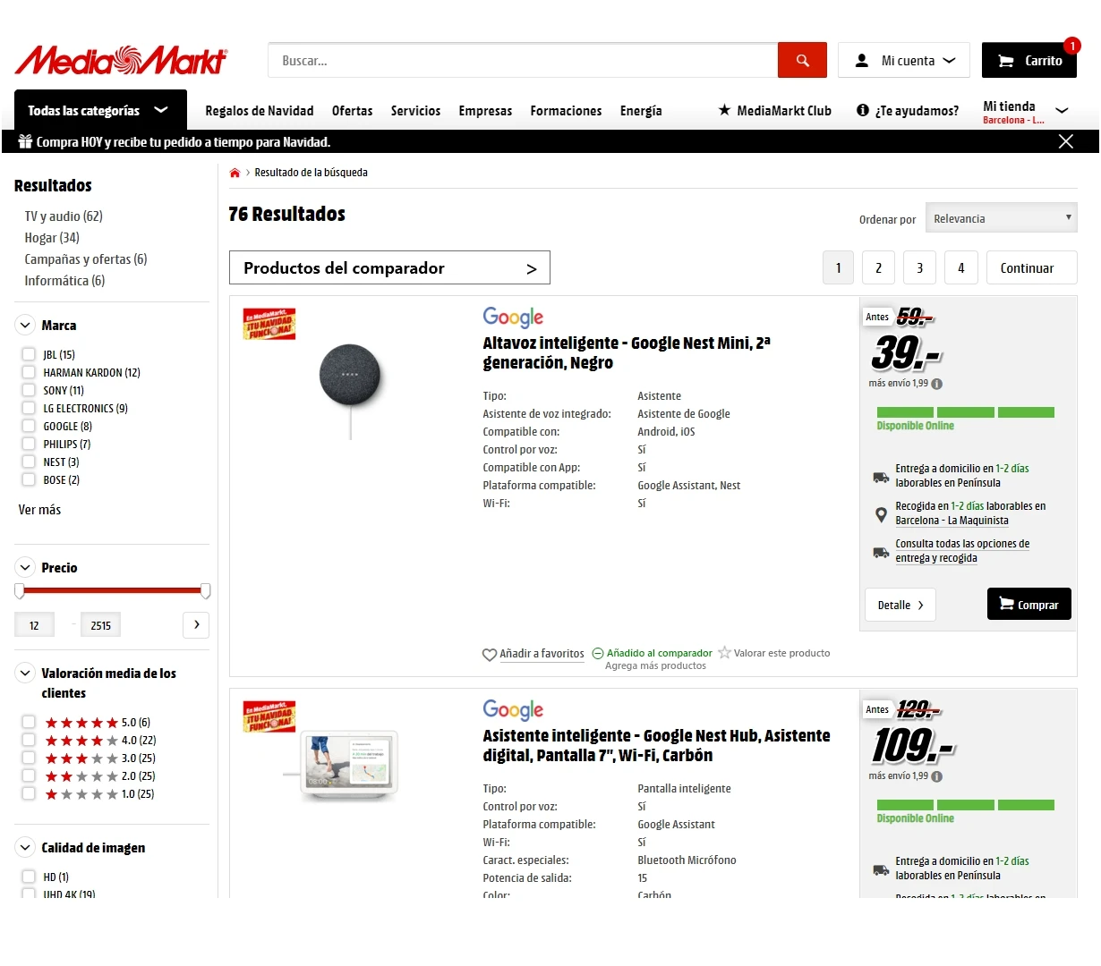
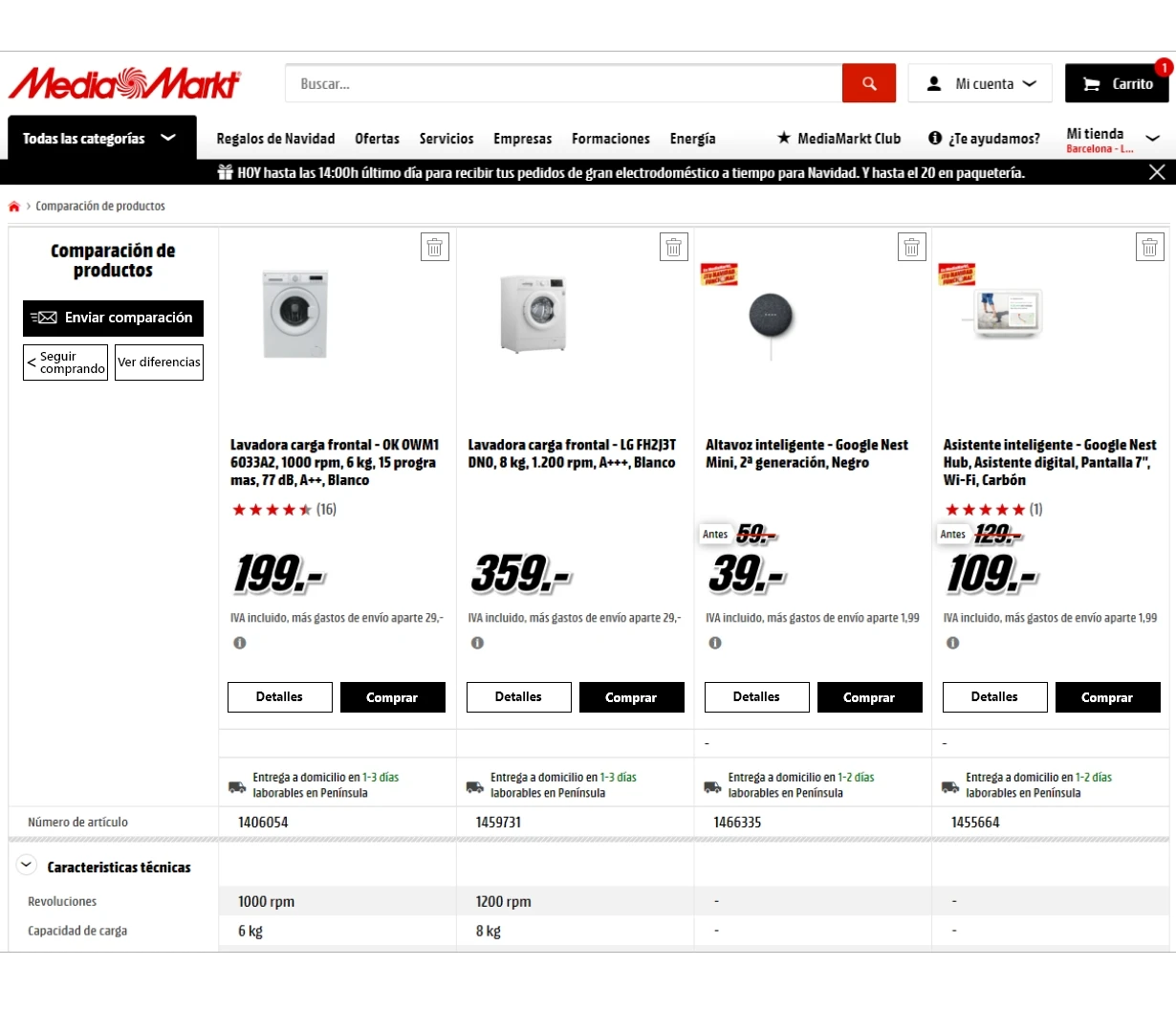
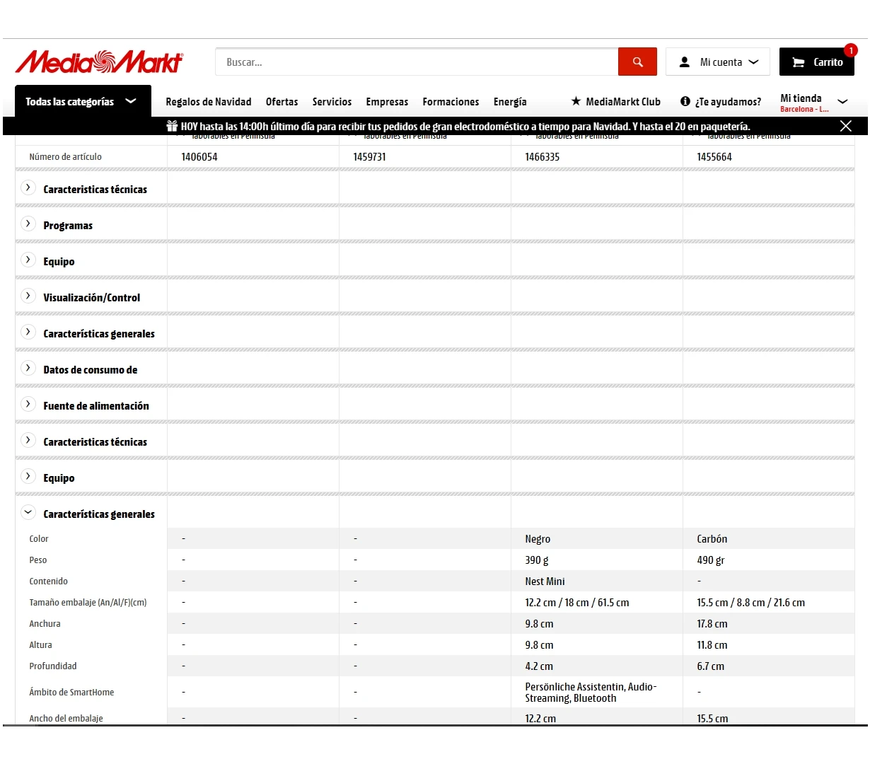
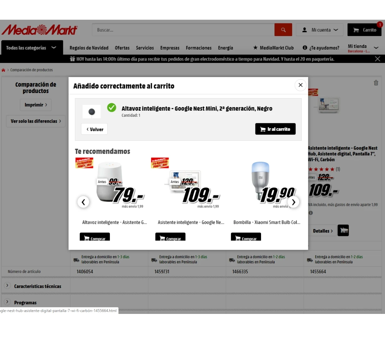
Product Comparator project
The product comparer is a feature that allows users of MediaMarkt Peninsula choose two products that they are particularly interested in and compare the performance of each of them. From the comparison screen they can buy the product that best meets their needs or continue shopping and comparing products.
My role in this project has been to propose a new navigation flow and new functionalities on both desktop and mobile. The proposal has been approved and is under study for implementation by the IT team.
The problem
MediaMarkt operates in a highly competitive e-commerce environment with:
Large product catalogs
Complex navigation structures
Multiple platforms (web + app)
Diverse regional experiences
This led to several UX challenges:
Friction in product discovery and comparison
Inefficient navigation and category structures
Inconsistent experiences across regions
Limited personalization and guidance for users
Users struggled to choose between similar products due to:
Information overload
Lack of clear comparison tools
Solution
Designed a Product Comparator feature allowing users to:
Select and compare multiple products
View key specs side-by-side
Make faster, more informed decisions
Objectives
The main goals of the project were to:
Improve user navigation and product discovery
Optimize conversion rates
Ensure consistency across platforms and regions
Introduce new features to support decision-making
Leverage data-driven UX improvements
Desktop flow


Mobile flow
Process
1. Research & Analysis
Conducted heuristic evaluations to detect usability issues
Analyzed user behavior data (analytics dashboards)
Benchmarked leading e-commerce competitors
Reviewed user journeys and drop-off points
2. Ideation & Design
Redesigned navigation flows
Proposed improvements in:
Category architecture
Search experience
Product discovery
Created:
Wireframes
Mockups
UX copy
3. Testing & Validation
Ran A/B tests to validate hypotheses
Measured impact using:
Conversion rates
Engagement metrics
Iterated designs based on insights
4. Implementation
Collaborated with development teams
Supported rollout across:
Desktop
Mobile
Regional platforms
MediaMarkt Canarias (Shopify Platform)
Context
A separate platform launched in March 2020 with greater flexibility and faster implementation cycles.
My Role
Unified design with Peninsula & German platforms
Created:
Wireframes and mockups
Landing pages (Shogun)
Developed:
UX writing (emails, SEO, category pages)
Improved:
Navigation and category structure
Impact
While specific KPIs are not disclosed, the project delivered:
Improved user flows and navigation clarity
Enhanced cross-platform consistency
Introduction of decision-support tools (comparator, recommender)
Stronger data-driven UX culture
Better alignment between UX, business, and marketing teams
Key Learnings
Data + UX intuition is critical in large-scale e-commerce
Small navigation changes can significantly impact conversions
Cross-team collaboration is essential for implementation
Scalable design systems are crucial for multi-region platforms
>> My account project
Currently, users who access their profile in MediaMarkt Canarias cannot track their orders or view their products under repair, because of that, are many calls and complaints about this limitation, so I have redesigned the «My Account «including these functionalities that are now being developed.
>> Frequently Asked Questions page
To make the MediaMarkt Canarias FAQ page equal to the Peninsula standards, I have consulted Google Analytics data to find out which pages were the most visited by users and sort them by importance. I have done the same with the internal topics, because in the FAQ’s home page only the three main questions are shown. I have also designed the iconography and layout and made the implementation of the main page in Shopify.
MediaMarkt Portugal
MediaMarkt Portugal is a site developed in Shopify, as MediaMarkt Canarias, which allows it some independence and speed in any implementation.
My role in MediaMarkt Portugal is:
Continuous audit of the site and App to identify weak points and propose improvements for users
Wireframes y mockups creation
Conceptualization and graphic proposal of new functionalities on the web, such as the visualization on the web of the new «click & collect» in store
Design and implementation of landing pages built in Shogun (Shopify’s app)
Content creation, UX writing and SEO writing
Shopify search engine optimization
Study and implementation of new apps as: warranties and services, limitation of unit sales per product and cart
Direct contact and weekly meetings with the team and Portugal Manager
Project management in collaboration with external companies
Data analysis in Google Analytics and creation of dashboards in Data Studio
>> Click & Collect or Express PickUp
MediaMarkt Portugal is developing the implementation of Click & Collect or Express PickUp in their stores. Users can access to this option through the product page of the web, choosing a pickup store, seeing if the product is available in it and changing the store if not. Geolocation plays a differentiating role in this proposal, as the system will make suggestions to the user of the closest stores based on their location.