
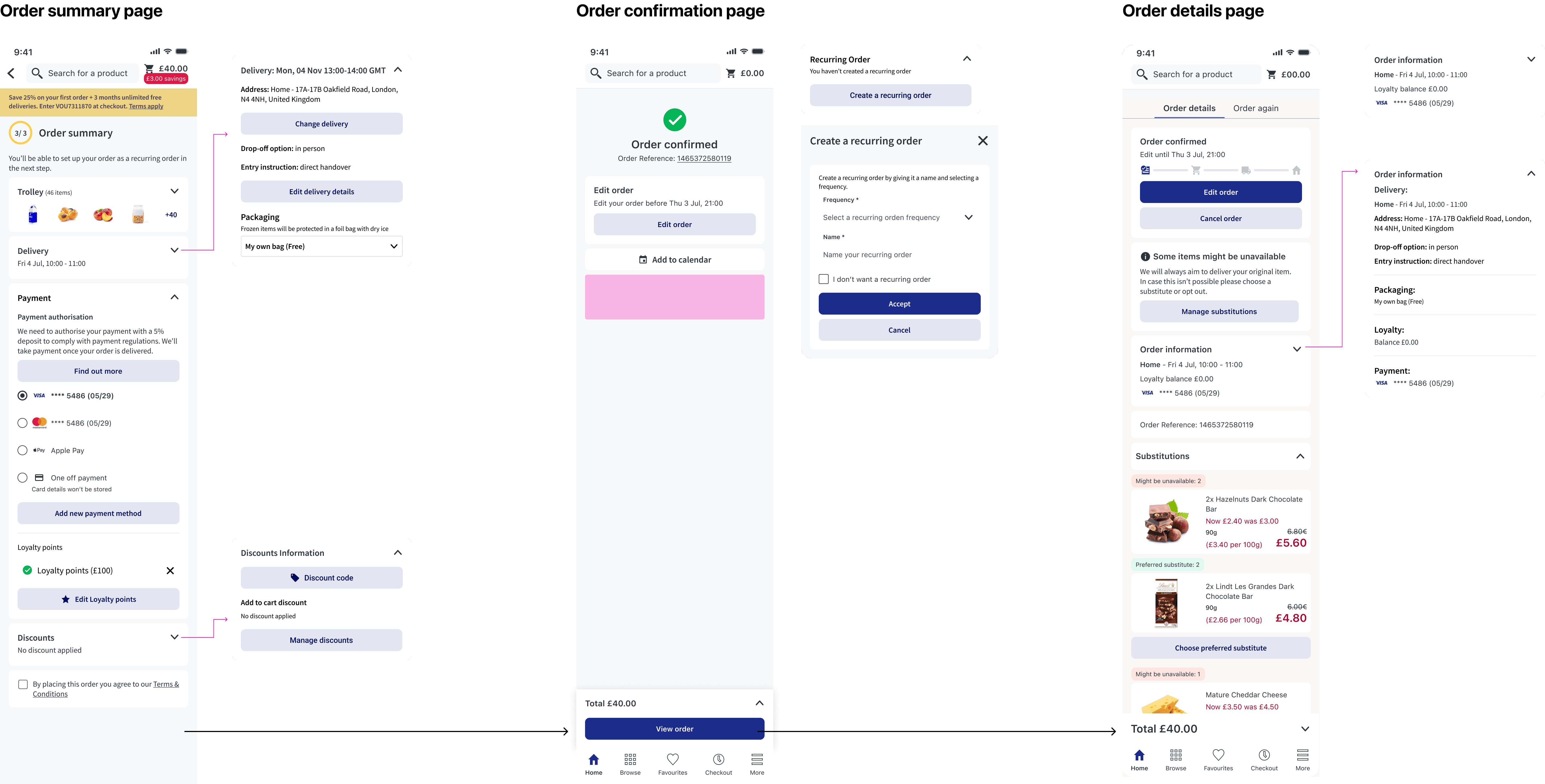
Decluttering order summary page
The problem
The Order Summary page creates unnecessary friction at the final and most critical stage of checkout, increasing cognitive load and likely contributing to abandonment.
The Order Summary page is currently cluttered, overloaded with information, and difficult to navigate. Customers must process multiple sections (voucher/loyalty, payment, delivery details, T&Cs, etc.) within a single dense layout, which creates cognitive overload and friction.
Also, there is a strong hypothesis that this clutter contributes to a significant portion of users dropping out before clicking “Place Order.”
One of our retailers highlighted that key sections such as voucher/loyalty and payment are hard to access due to the amount of content displayed. Additionally, previous research identified clutter and content overload on the Order Summary page as recurring pain points.
Business Impact
The Order Summary page sits at the bottom of the conversion funnel. Any friction here has a direct impact on:
Conversion rate
Checkout completion rate
Revenue
Customer satisfaction
Time to purchase
If customers drop before clicking “Place Order”, we lose revenue after they have already shown strong purchase intent. Friction reduction in critical journeys Conversion & Checkout Performance
Stakeholders impacted:
Customers (frustration, confusion, longer checkout time)
Retailers (lost revenue)
Product & Growth teams (lower conversion performance)
Business (reduced checkout efficiency)
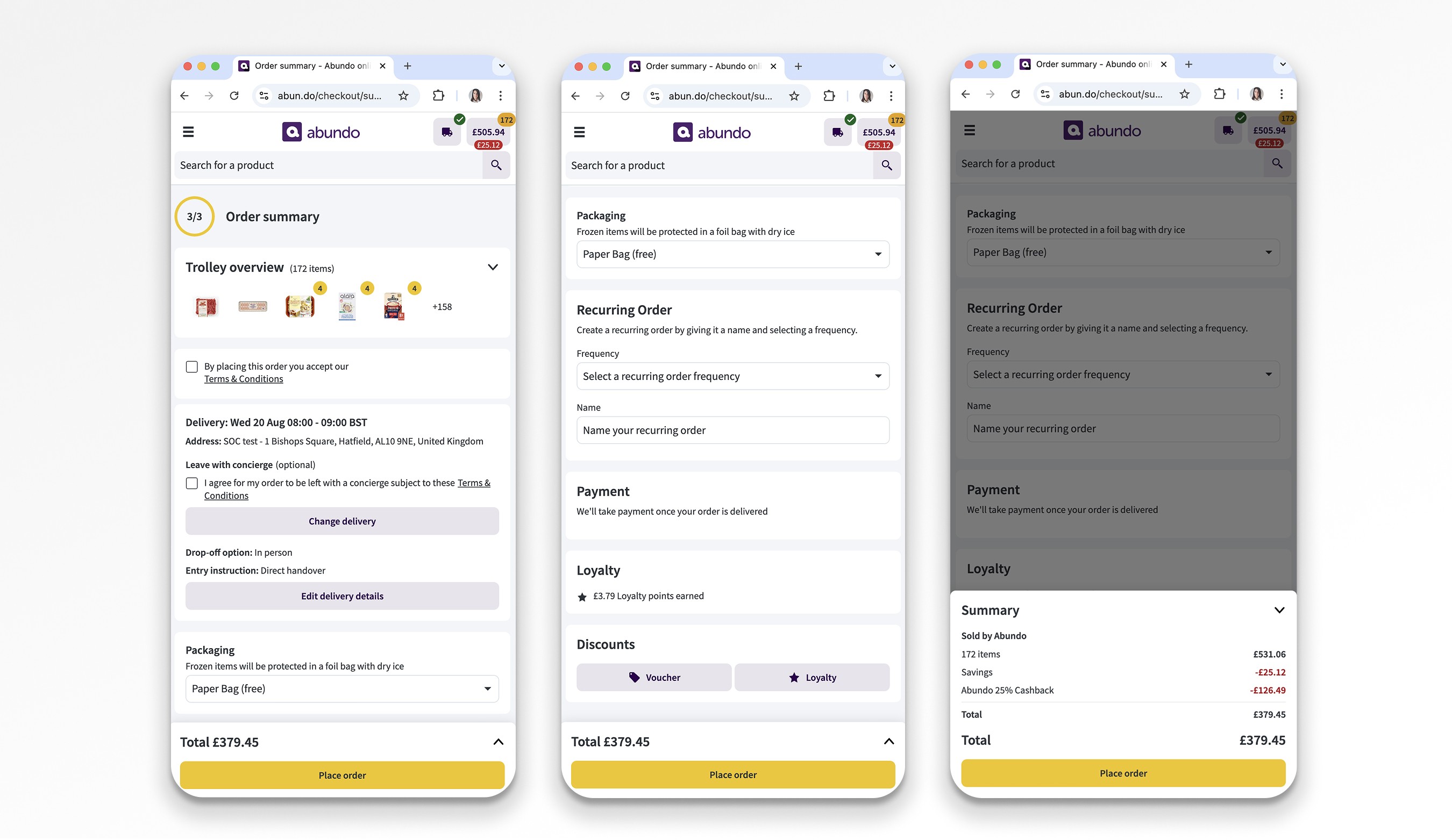
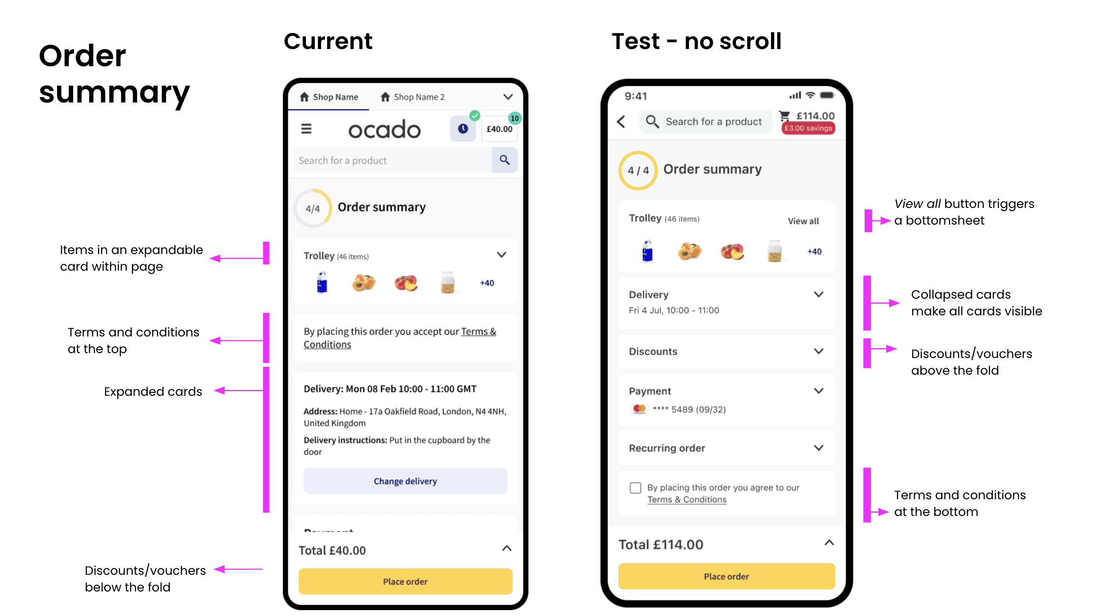
Current design
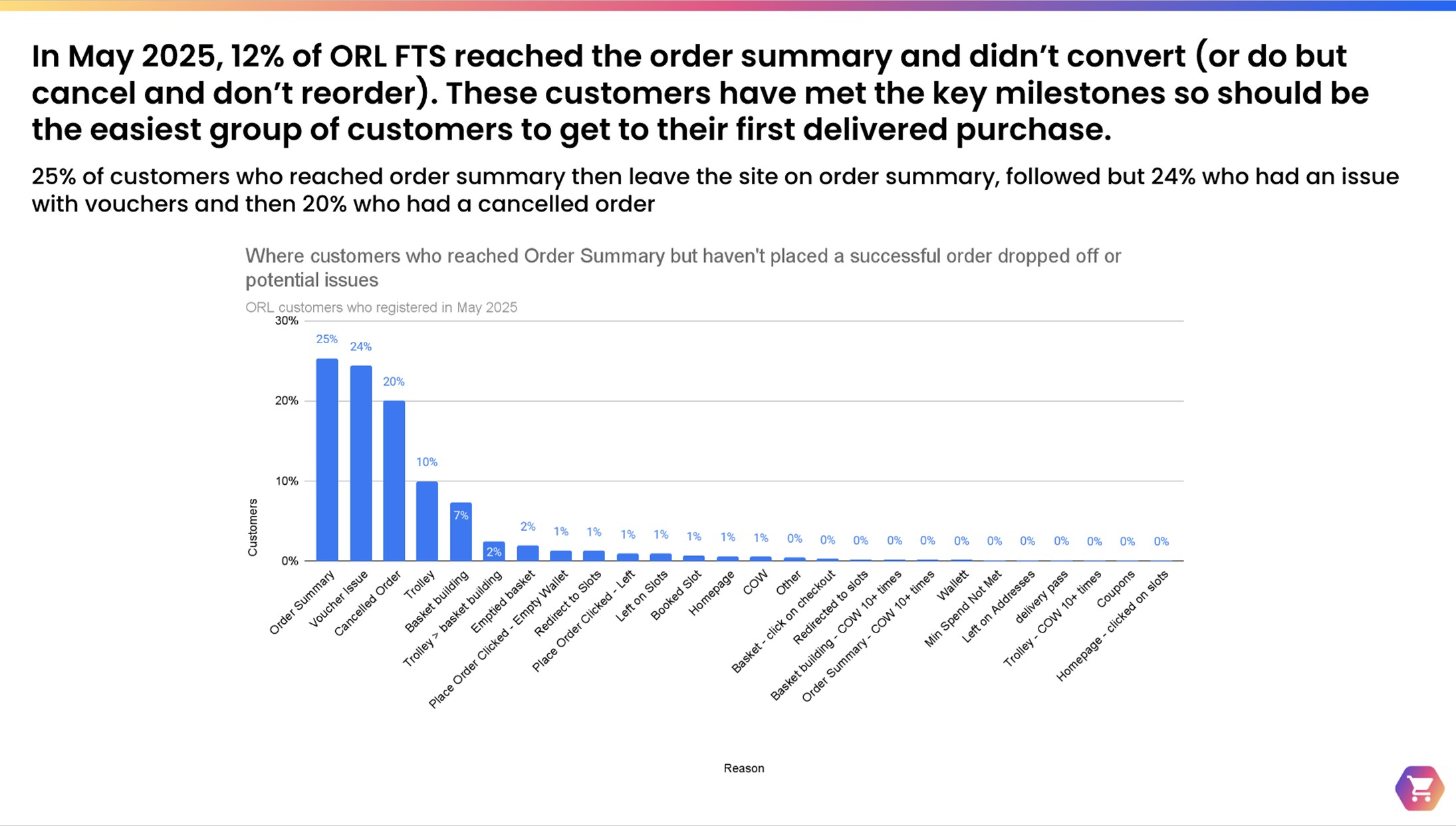
Data
25% of customers who leave on the order summary page do so with no apparent reason as to why they’ve dropped off
24% of customers have a voucher issue
20% have a cancelled order with no future order
19% leave on the Trolley page or Basket Building
26% of all customers who reach order summary and don’t convert (excluding customer who have a cancelled order) do actually click on place order but this never goes through. 21% receive an empty wallet error but the remaining 4% receive no error but there could be a variety of reasons why this is the case
Hypothesis
By restructuring the Order Summary page through clearer information hierarchy, progressive disclosure of non critical content and increased visibility of key actions, we will reduce cognitive load in the users and they will be able to more easily identify, understand and complete the required steps without missing critical inputs. With that action we expect to decrease the time to complete checkout, reducing user’s drop-off before “Place Order.”
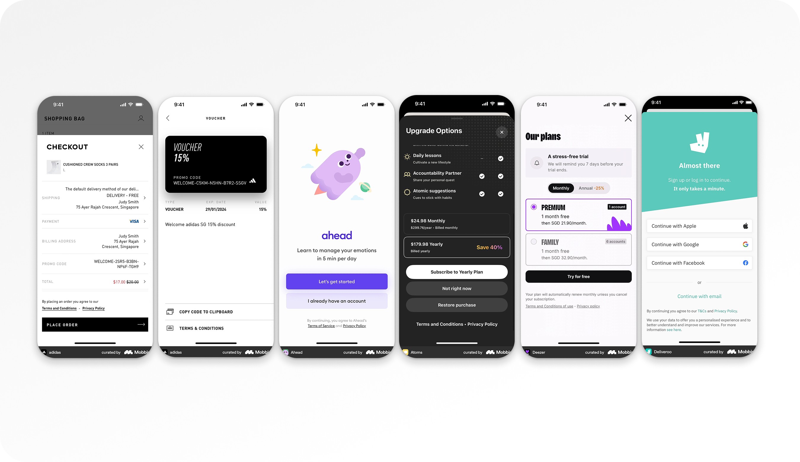
Benchmarking
Terms & Conditions
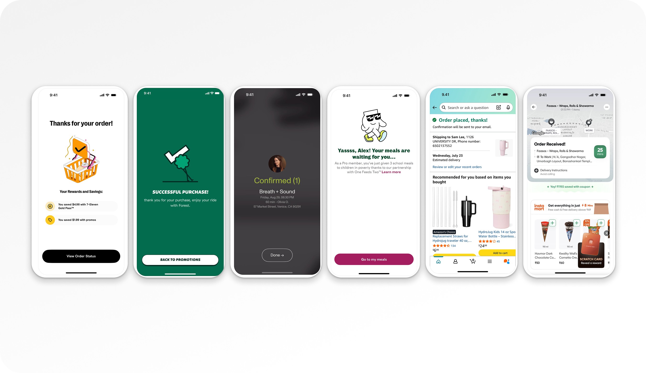
Order confirmation page
UX Strategy
Reduce the time spent between entering the Order Summary page and clicking “Place Order.”
1. Reduce Cognitive Load
Reorganize information hierarchy
Remove redundancy
Prioritize critical actions
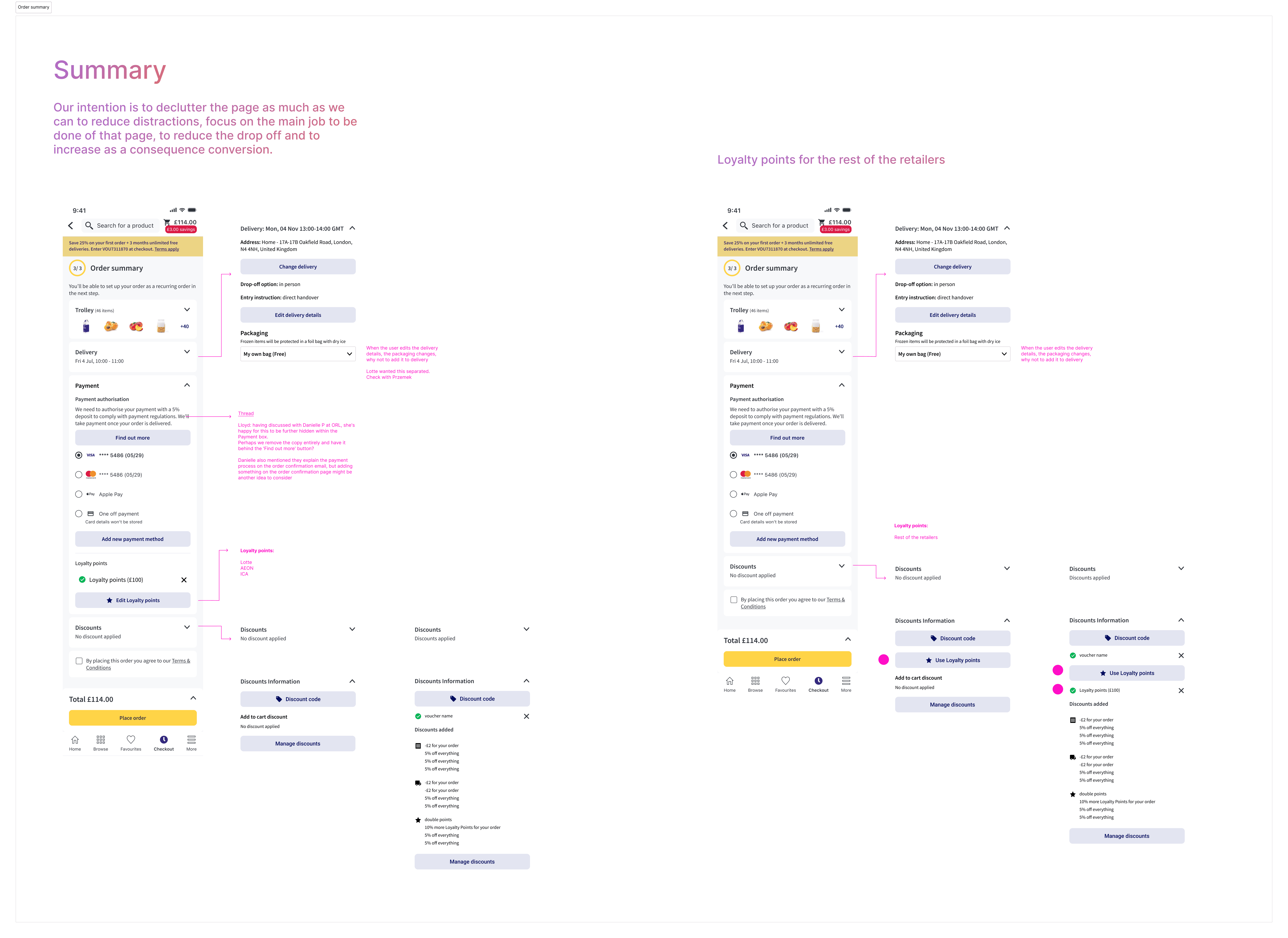
Compare what is displayed on Order Summary vs Order Confirmation (avoid repeating unnecessary content)
2. Progressive Disclosure
Introduce collapsible sections to reduce visual clutter.
However, if components contain required user actions (e.g., age checkbox, T&C acceptance, payment method selection, delivery address selection), keep it opened because collapsing them may hide critical tasks.
We must evaluate:
Should required actions ever be collapsed?
If collapsed, how do we signal incomplete required actions?
How do we prevent missed inputs?
3. Improve Action Visibility
Make primary CTA (“Place Order”) dominant and persistent
Improve visibility of payment selection
Consider improving tracking around adding payment method
4. Improve Tracking & Measurement
Update tracking for:
Payment method addition
Interaction with collapsed sections
Time spent on page
Scroll depth
Drop-off before “Place Order”
Working on these 3 pages holistically
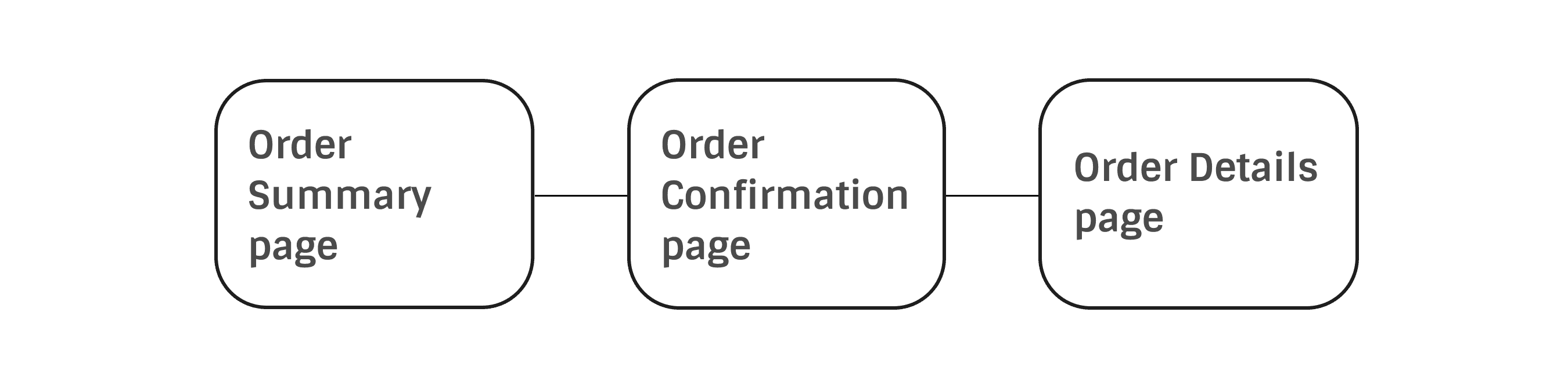
Order Summary page
A/B Test - Collapsable cards
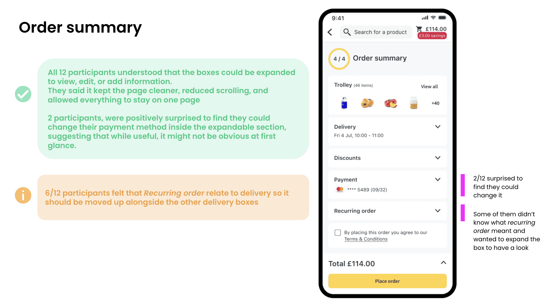
Key Takeaways
The Order Summary page is a high-intent, high-impact conversion step.
Clutter and excessive content likely contribute to abandonment.
Reducing cognitive load is the primary UX objective.
Progressive disclosure can help — but must not hide required actions.
Improved tracking is necessary to measure real impact.
Success will be measured through reduced time-to-order and increased completion rate.
The Order Summary page is a high-risk, high-impact conversion point.
Two issues coexist:
Cognitive overload affecting checkout completion.
Low voucher discoverability affecting redemption and revenue.
The voucher issue alone represents a potential £1–2m annual revenue impact.
Progressive disclosure can help reduce clutter, but must not hide required actions.
A/B testing is essential before scaling changes.
Improved tracking is critical to properly measure impact.
Order Confirmation page
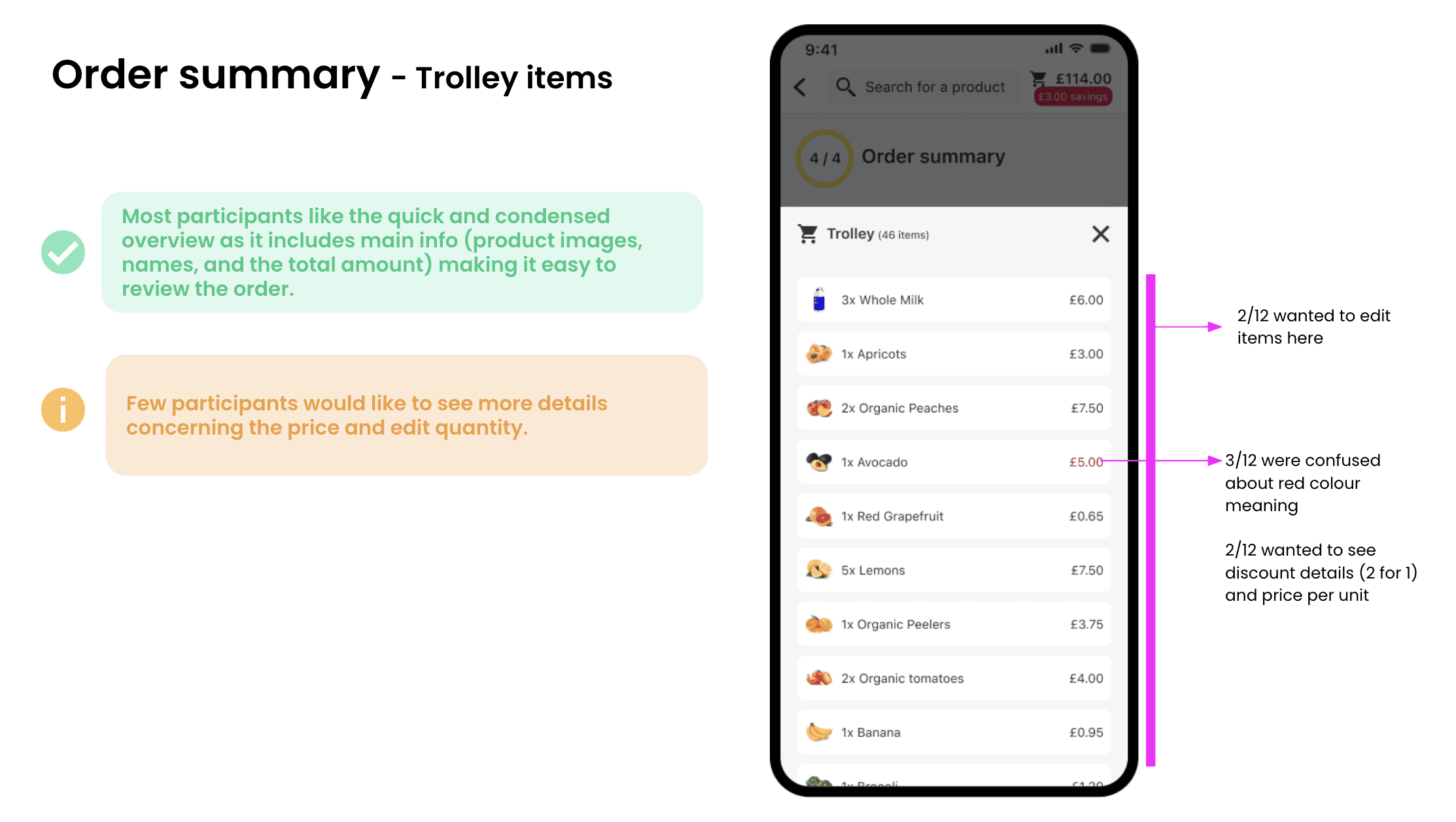
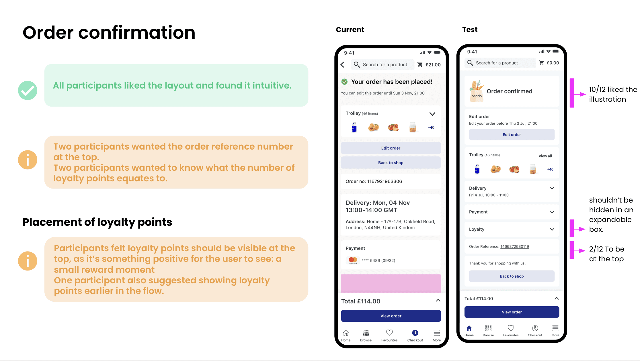
Usability Test - Different layout & Loyalty points
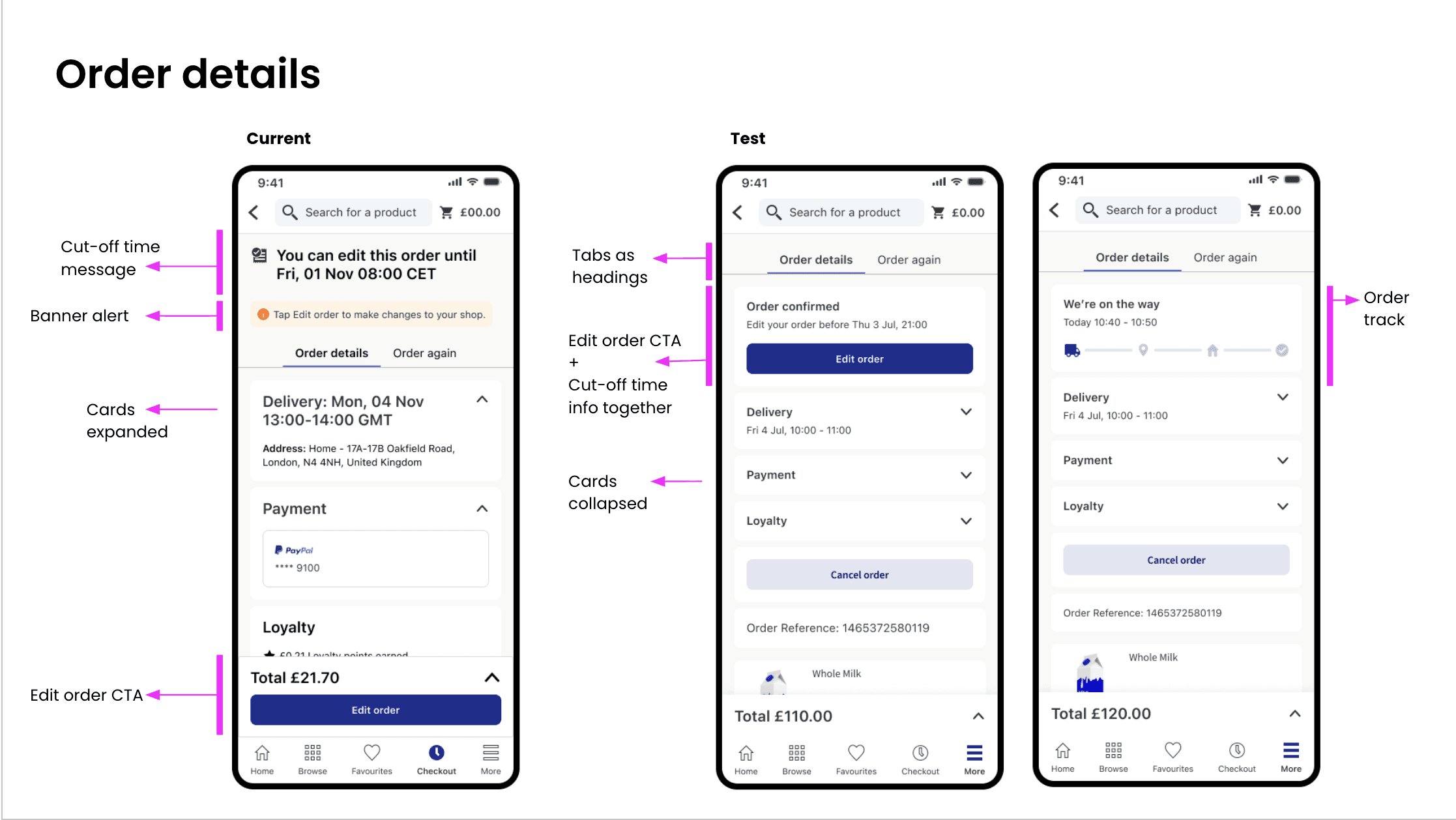
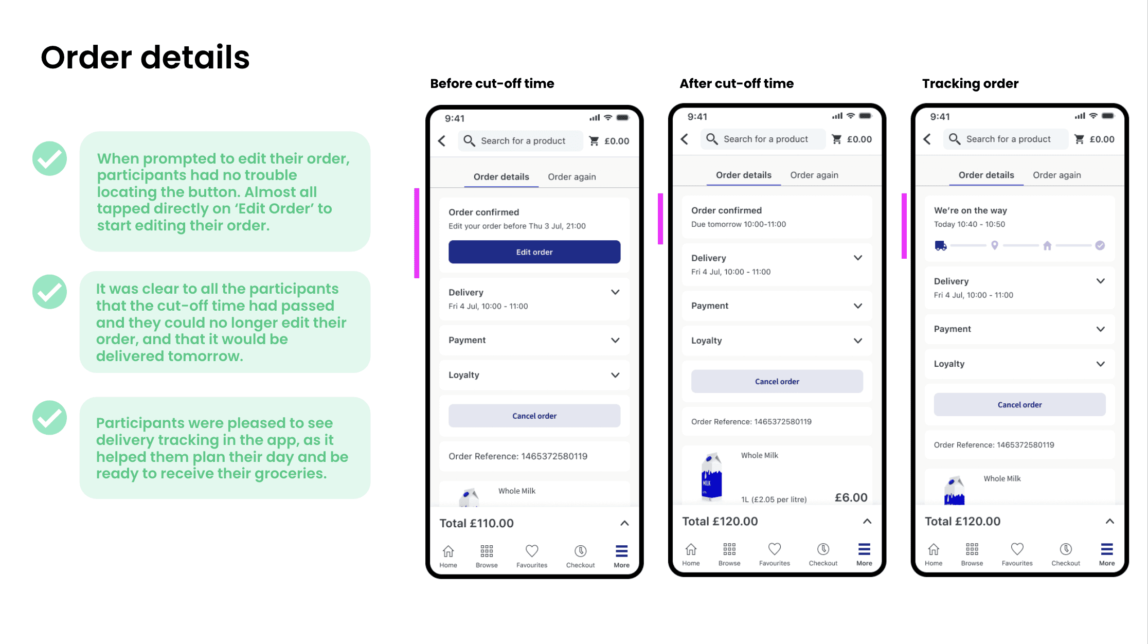
Order Details page
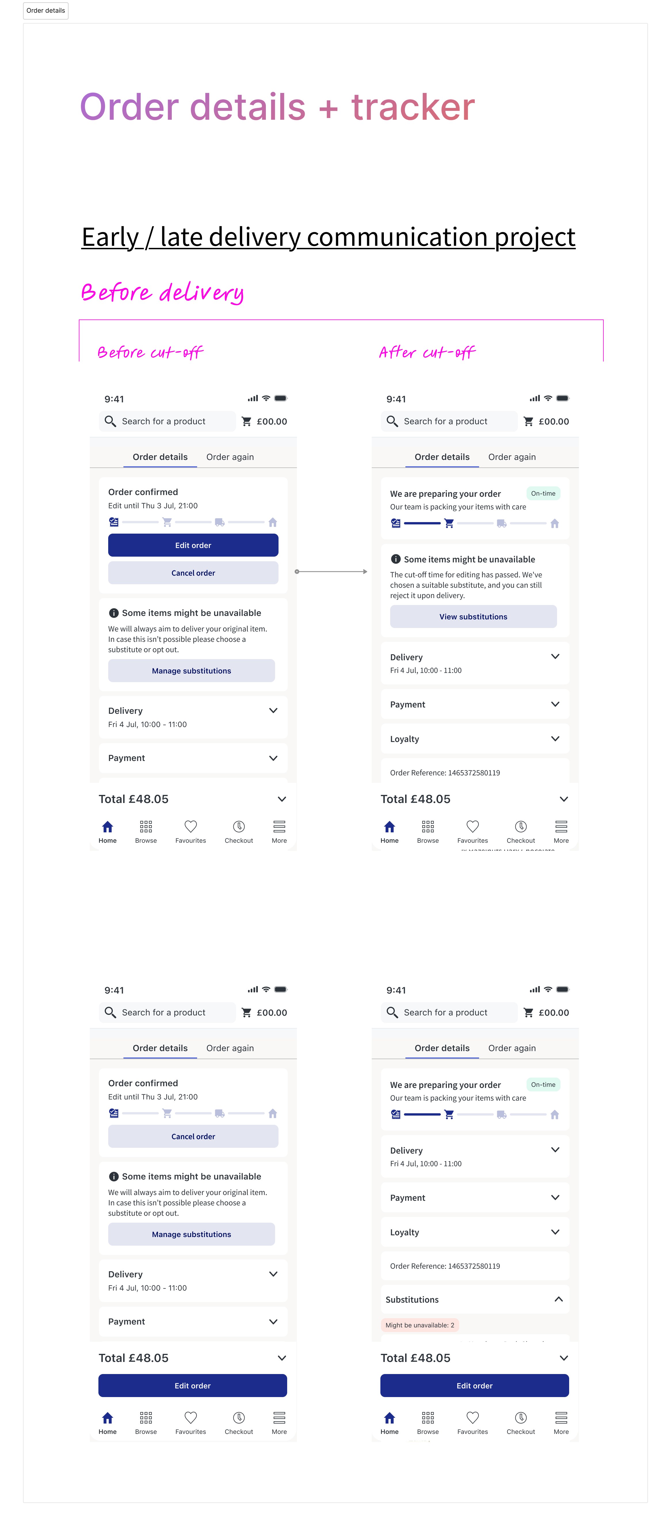
Usability Test - Collapsed cards & Order tracker
Final design
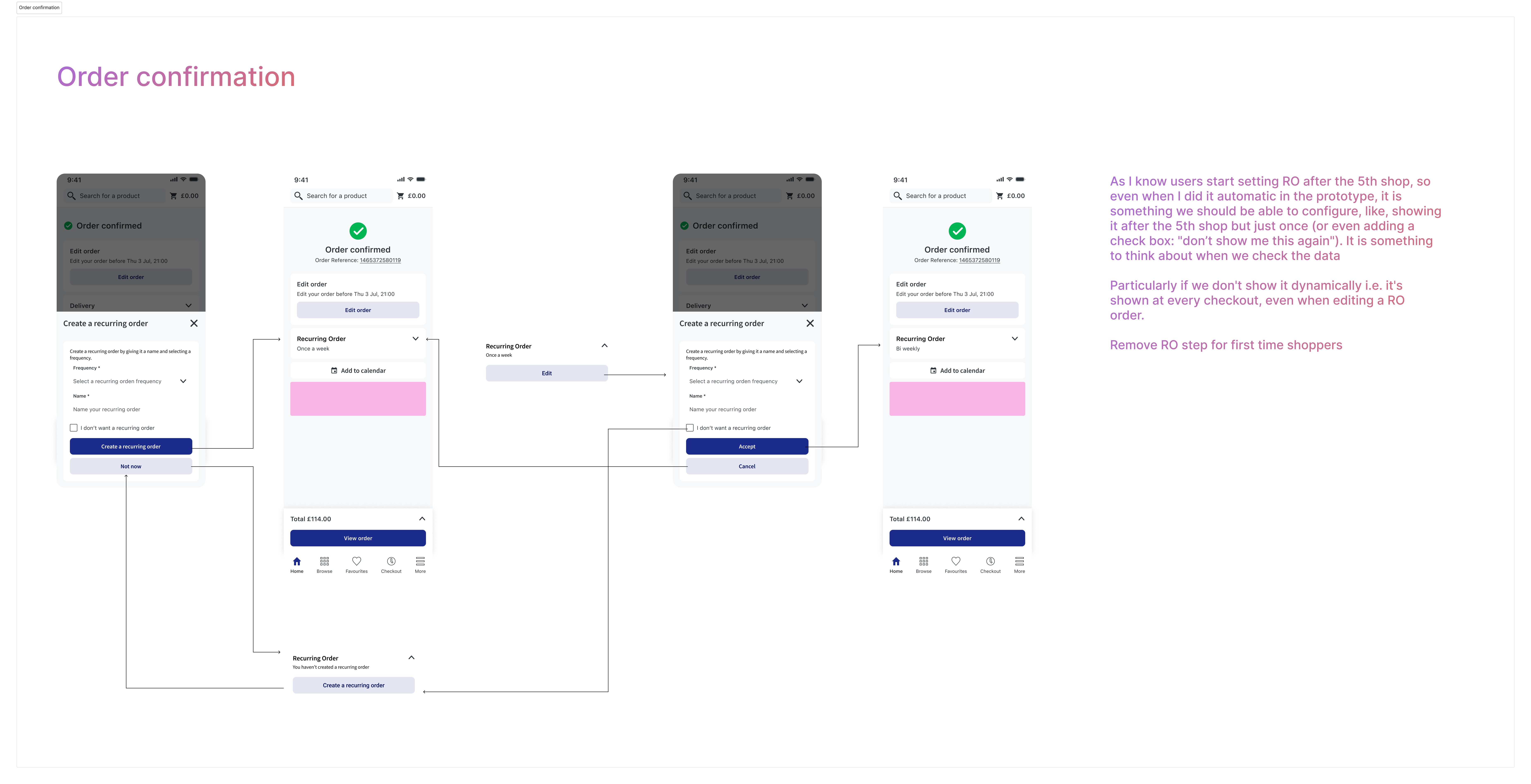
In this video you will be able to see the solution I created for recurring orders after moving removing it from the Order Summary page and moving it to Order confirmation page. As we have seen in data, users start creating recurring orders after the 5th shop, se we have stablished that the bottom sheet will open automatically just after that period of time.
Holistic solution
Solution for recurring orders
We also want to test payments moving it's position to the top and keeping it opened for fisrt time users
Payments section test
Key Design decisions & Tracking
1. Reduce Cognitive Load
Reorganize information hierarchy
Remove redundancy
Redesign Order Summary, Order Confirmation and Order Details pages
Remove the search bar of these pages to reduce drop off and distractions
2. Progressive Disclosure
Introduce collapsible sections to reduce visual clutter.
If components contain required user actions (e.g., age checkbox, T&C acceptance, payment method selection, delivery address selection), keep it opened.
3. Improve Action Visibility
Improve visibility of payment selection
Consider improving tracking around adding payment method
Keep testing with the position of the elements, specially moving payments to the top for first time users
4. Improve Tracking & Measurement
Update tracking for:
Payment method addition for first time users
Interaction with collapsed sections
Voucher’s use
Time spent on page
Scroll depth
Drop-off before “Place Order”