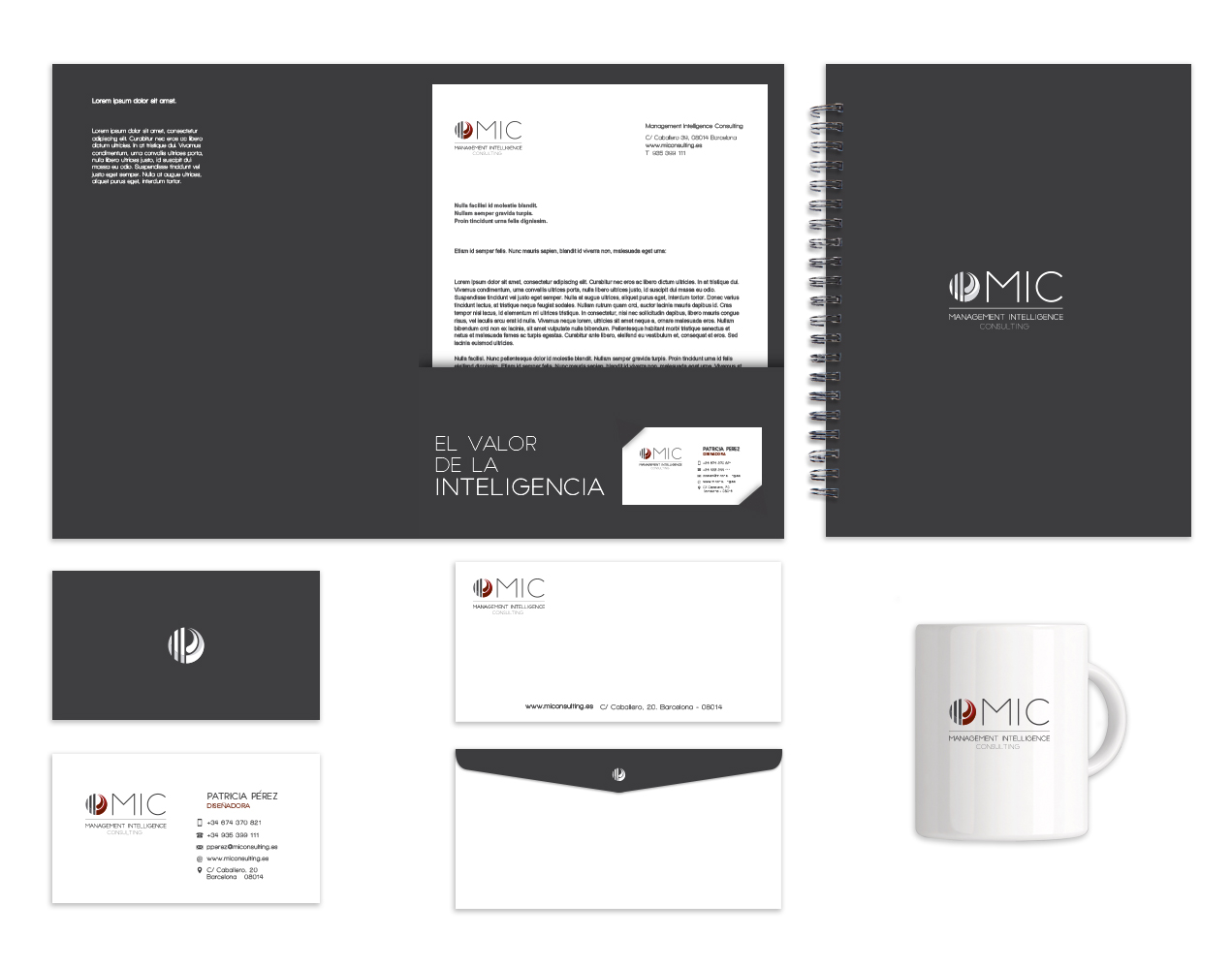
«MiConsulting« is a young and very professional company that needed to fit its idiosyncrasy with its image and corporate identity. The first step was to rethink the type of communication that the company wanted to have, concluding that closeness was the correct strategy, so warm colors were the basis for the redesign.
The design of the new logo is full of symbolism and perfectly embodies the company’s new claim: «The value of intelligence». Intelligence is often represented with a brain. In the MIC isotype, the presence of both hemispheres is graphically abstracted to form a left hemisphere full of analysis, logic, and planning, and a right hemisphere empathetic and responsible for our perception of the world in terms of color, shape, and place.

Heath sector adaptations

